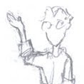
I arrived at this year's Illustration Master Class with a couple of rough thumbnails, and spent the first day refining them into the sketch from the last post. Rob, Dan, and Donato gave me some good advice at the early stages. When it came time to work up the drawing Steve knocked out a quick model for me, and I shot fellow students -- Grant, Aaron, Kim, and Annalisa -- for reference. And, of course, I made stuff up.
The drawing -- which I mounted on a panel to paint over -- was roughly 17 3/8" x 12 3/4".

I started painting by glazing in the sky, roughing in the smoke on either side of the ring, and blocking other parts in. I'm trying to work back to front, and to stay patient.

Next I worked in the ring, and the spattered explosion. At this point the sky was still tacky, so I held off editing the spatter until I was comfortable I wouldn't pull anything back up.

More work in the ring, and the first stage of paint on one of the main figures.

The first layer of paint down on the first face. I wiped off the first three or four attempts. I also gave the sky and smoke some more attention.

The first layer down on the second face, and a second layer on the first. I also darkened the smoke behind the figures to help separate them from the background. A bit of paint on the midground figure too.

More work in the midground, foreground, and figures.

The week was almost up, but I was able to get a first layer of paint down on the remaining figure and the flag, and do some general trouble shooting.

And this is how the piece ended the week, photographed after I got home (and adjusted a little in Photoshop).


Ooh Drew... can I be quite critical? And by critical I mean cutting? If yes then read on.
ReplyDelete... My feeling is that the right hand side of the painting is unecessary. If you take a vertical crop from just beyond halfway you get a perfectly serviceable illustration because nothing is really happening on the other side. HOWEVER: if this is a cover jacket to wrap around a novel then ignore everything I just said. ;)
Hey Drew! This really came together nicely. Still love the diagonal slant that the whole composition takes on, gives a nice feeling of space/partial gravity "third book where everything goes horribly wrong" shenanigans.
ReplyDeleteIt was great to meet you at the IMC and pleasure to work a few easels down from you. And many thanks for the shout out on the podcast, glad my humble comments were useful. Take care!
This came out really sweeeet! Thanks for posting the process and it was nice to meet you at the IMC! :)
ReplyDelete